From the Bauhaus to house music, from skyscrapers to the city grid, Chicago has long been a place where design, civic imagination, and hands-on making shape the world. The Chicago Design Archive preserves that influence, documenting the people, objects, and ideas that define the city’s design legacy. To extend its preservation efforts and engage a new generation, CDA partnered with us to create the identity for its public auction.
The system began with a formal insight: Chicago, Archive, and Auction all share the same character count. Stacked vertically, the words form an architectural spine, echoing the structural logic of the city itself. The repeated word Design becomes the throughline, threading continuity across the identity and reinforcing the event’s purpose.
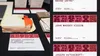
The goal was to break from the reserved visual tropes often associated with archives and auctions. Instead of quiet minimalism or institutional reverence, typography became the force. The identity transforms the archive from a place of static preservation into a platform for active participation.
The logo behaves like a living grid: stacked, compressed, assembled, and reconfigured with intent. It breathes and pulses, becoming more kinetic system than fixed mark. Its motion suggests tension, release, and anticipation—an archive in action.
That energy carried across the auction experience. Donated works, designers, and bidding moments were introduced through movement, all timed to the same internal beat. The result was an identity that made participation feel immediate, collectible, and alive.
Design as investment: the auction generated 300% revenue growth compared to previous years, boosted donated works through renewed confidence and excitement around the event, delivered record attendance with a sharp rise in cross-generational engagement, and expanded CDA’s public reach through higher social media visibility and sustained attention.
- Concept, Design Direction, Strategy
- Nick Adam
- Design, Animation
- Kevin Moreland
Chicago Design Archive