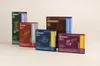
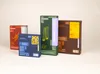
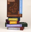
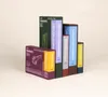
This project reimagines Kalustyan’s, a legendary New York spice emporium, through a packaging system built on information rather than ornament. Inspired by the living architecture of a plant, Underground (root/ rhizome), Seed, Body (bark/leaf,) Bloom (flower/bud), and Harvest (fruit), a five part structure drives the brand’s color language, where each color communicates meaningful information about the spice.
Inspired by the density and the order of Kalustyan’s shelves, the identity transforms abundance into clarity by structuring a wide range of product details directly on the packaging. Guided by the principle of specificity over cultural symbolism, the system avoids decorative motifs and instead presents exact information such as origin, plant part, processing, and other key attributes in a clear, consistent format.
This addresses a common challenge in spice packaging, reliance on vague storytelling or generalized visual cues that obscure real information. By prioritizing precision, the system enhances usability, builds trust, and creates a scalable framework across a diverse product range. The result is a cohesive identity where information itself becomes the design language, offering clarity for customers and flexibility for the brand.
- Designer
- Purva Dalvi
- Mentor
- Jennifer Cole Phillips
- Mentor
- Abbott Miller