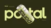
We partnered with Portal Beverages to develop a naming architecture, identity, and packaging system for a new line of purpose-built CBD drinks. Designed around real moments of use, the system balances clarity of function with a sense of energy and optimism.
The visual language is direct and intuitive. Color becomes a primary signal, mapping to mood and time of day, while product names clearly communicate intended benefits. The typogrpahic identity subtly references the idea of a “portal”—a transition from one state to another— through repetitive geometric letterforms and pattern without relying on overt or tongue-in-cheek cannabis cues.
In production, the brand concept is heightened through a restrained yet thoughtful approach to material finishes. Matte finishes are contrasted with spot gloss details, creating a tactile experience that invites handling and reinforces the idea of transformation.
The result is a packaging system that feels purposeful, accessible, and elevated—meeting consumers where they are, while guiding them to where they want to go.
- Creative Director
- David Sieren
- Designer
- Nick Rissmeyer
- Designer
- Kyle Meyer
- Copywriter / Strategist
- Melinda Benoit
Chicago Design Archive