Omega Yeast Labs grows over 75 strains of liquid yeast for craft brewers across the country, and by 2017 their reputation had outgrown their brand. The founders, Mark and Lance, knew it. One of them wanted to explore a rebrand. The other wasn't convinced. So we started small: no pressure, no big leaps, just an open door. A brand workshop with both founders brought the company's purpose, positioning, and ambition into the room at the same time. From there, the direction became clear.
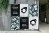
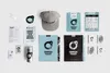
Rather than leading with science, we led with the material itself. We activated Omega's yeast in a warm sugar solution, mixed it with India ink, and scanned the organic textures that emerged. Those fifteen yeast paintings became the foundation of the visual identity: raw, unpredictable, and unmistakably alive. The logo pairs a clean letter O with a budding yeast cell, a mark that reads as confident and precise from a distance and as specific to the craft up close. The new tagline, "Craft Yeast for Craft Brews," gave the brand a voice to match. The system extended across packaging, apparel, environmental signage, interior graphics, and a new website. Within a year of launch, Omega saw customer growth of over 100%, revenue growth of over 150%, and web traffic growth of over 90%. The brand was recognized in Communication Arts, The Dieline, Awwwards, and others. In 2024, Omega Yeast was acquired by AB Mauri North America, a global fermentation company. The work didn't just change how they looked. It helped shape where they ended up.
- Agency
- Knoed Creative
- Creative Director & Designer
- Kyle Eertmoed
- Designer & Contributor
- Kim Knoll
- Web Developer
- Brett Burwell
- Architect
- Valerio Dewalt Train
- Sign Producer
- Rightway Signs
- Interior Photographer
- Tru Studio
Project link
Chicago Design Archive