Sunlight on chrome. Prayer in paint. Lowriding is more than customization. It is an American and Chicano art form built from devotion, design, memory, and pride. In 2025, as scrutiny around Latino identity intensified, Slow & Low faced a direct question: hide or shine?
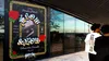
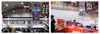
During Hispanic Heritage Month, the festival answered by transforming Navy Pier into a civic stage for a living culture. Curators Lauren M. Pacheco, Peter Kepha, and Edward “Magic” Calderon united more than sixty car clubs, bringing together families, artists, builders, and multigenerational communities. In close collaboration with the curators, with the client we led a civic-scale identity system built to carry that voice with courage and care.
Slow & Low is a public exhibition authored by the community it serves. The identity needed to be bold without spectacle, reverent without nostalgia, and accessible without flattening the depth of the tradition. The goal was not to decorate lowrider culture from the outside, but to help create the conditions for it to be seen, celebrated, and respected at full scale.
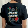
The system builds on a chain motif as a symbol of lineage, continuity, and strength. Around it, roses bloom and vines climb. Drawn from bud to full bloom, the roses reflect the four generations often present together at the festival. In Chicano visual traditions, roses carry associations of love, family, faith, and Marian imagery. Here, ornament becomes a living system of protection, devotion, and growth.
Typography is the central voice. The curators brought Teen Angels into the conversation, the influential magazine that helped define how Chicano culture looked, read, and represented itself. Rather than imitate that history, we translated its spirit through a contemporary typographic system rooted in expressive hand styles, blackletter influence, script virtuosity, and calligraphic warmth.
At the center is a customized version of Respira, softened with a marker-like hand and filled with a blue-to-yellow gradient that feels like sunset on chrome. The gesture nods to lowrider murals, sign painting, devotional graphics, and 1980s Chicago graffiti without pastiche. It is reverent and defiant, soft but not fragile.
Extended through Cordier Script and Rosalie, the identity brings together pinstriping, hand lettering, ornate grace, roses, vines, chains, and color into a system that breathes with the culture it represents.
The result is a festival identity that carries pride at civic scale: authored with the community, built from lineage, and designed to let Slow & Low shine without dilution and without fear.
- Design Direction, Design
- Nick Adam
- Design, Animation
- Kevin Moreland
- Illustration
- Alec Hudson
- Curatorial Team, Creative Director
- Lauren M. Pacheco
- Curatorial Team, Creative Director
- Peter Kepha
- Curatorial Team, Photographer
- Edward Magico Calderon
- Photographer
- Max Herman
- Photographer
- Nick Lipton
- Photographer
- Katrina Nelken
- Photographer
- Mike Pocious
Chicago Design Archive