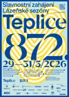
Teplice – a city with a melody
The new visual identity of Teplice was created in 2025 by designers of Monsters studio, Michaela Labudová and Pavel Frič, as a functional, comprehensive tool for high-quality external and internal communication of an exceptional spa, cultural and sports center.
Teplice is a city of meeting people, historical and cultural influences and landscapes. It is an attractive tourist destination for visitors from home and abroad. This diversity gives the city a lively rhythm and a playful melody at the same time. The city of Teplice organically connects diversity and reflects pride in history and the present. The residents of Teplice are patriots. “We live in Teplice. We are the living heartbeat of Teplice.”
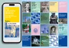
The new visual identity of the city of Teplice offers a comprehensive variable system of visual elements and formats, which together create a recognizable face of all common outputs, which will ensure effective communication and building a comprehensible image of the city towards the public and its visitors.
Brand and visual identity of the city of Teplice
The new brand of the city of Teplice is representative and elegant at the same time. The purely typographical design is based on the confident organic combination of two significantly different font characters into one logotype.
The unique character of the city brand and the new identity as a whole is largely based on the use of the modern, sovereign Raptor font, in combination with the optically attractive, dynamic Prizma font. Both fonts come from the Czech font foundry Superior Type and, despite their mutual contrast, they complement each other well and set the fresh character of the new visual style. The author of the original drawing of the Prizma font is the renowned graphic designer and teacher Rostislav Vaněk.
- Concept and graphic design
- Monsters – Michaela Labudová and Pavel Frič
- Motion design, video, photography
- Katřina Javůrková
- Photography
- Jiří Dvořák
- typefaces, custom type alteration
- Superior type
Project link