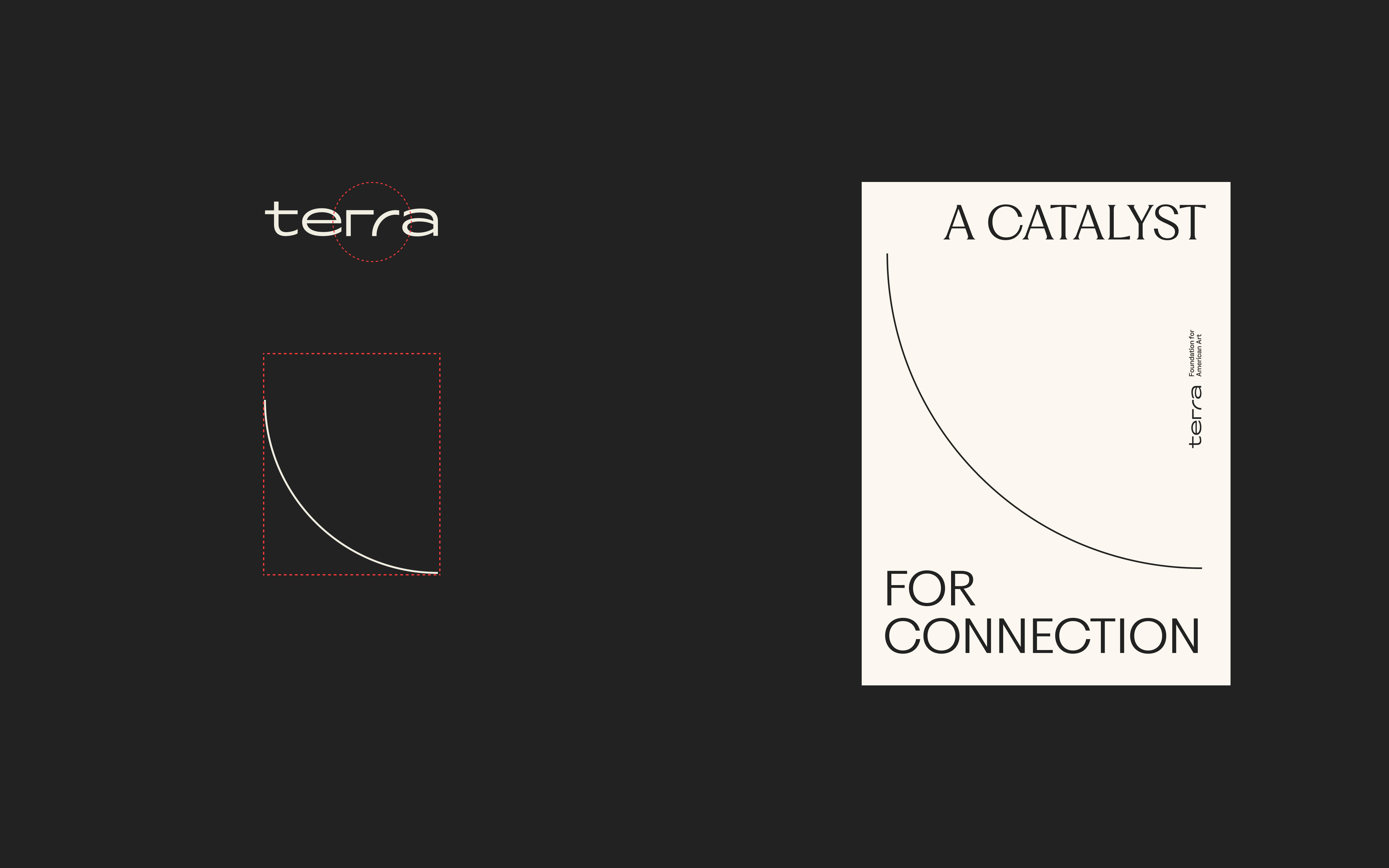
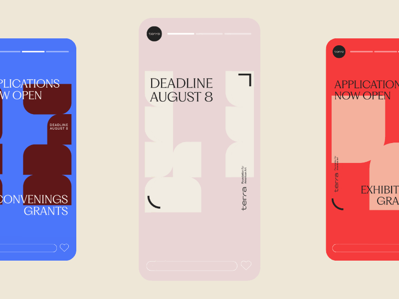
The Terra Foundation’s 2025 brand refresh reflects the organization’s shift toward a more inclusive narrative of American art. The identity is grounded in a sophisticated typographic system that pairs Fragment and Ginka, balancing institutional prestige with approachability. The distinctive curvature and geometry of the wordmark’s iconic “rr” generates an elegant, responsive framing device, used to elevate visual storytelling and amplify grantee work. The flexible visual language ensures the foundation’s mission resonates clearly across its diverse international audience, and all environmental, print, and digital touchpoints.
- Strategy
- Kristin Lueke
- Design
- Nermin Moufti
Chicago Design Archive