Echo Vie was created by Susie Lee, a makeup artist and four-time cancer survivor whose experience with illness changed how she thought about everything she put in and on her body. The products she developed were natural and nontoxic by conviction, not trend. The brand had to carry that weight without feeling heavy.
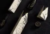
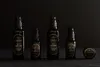
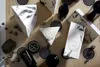
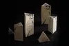
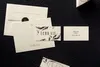
Most skincare branding had settled into a clinical aesthetic: clean white, sans-serif type, minimal everything. For Echo Vie to stand out, the packaging needed to feel like something else entirely. We explored colored and textured papers, custom box shapes, and organic illustration until the identity found its footing: ivory feltmark paper, a hand-drawn botanical illustration, and gold foil on custom triangular boxes. The name, which translates from French as "a reflection of life," guided the logomark. The EV monogram draws from classic Parisian lettering and French apothecary references, designed to feel both current and timeless. The result is a brand that reads as premium and artisanal, warm and sensory, and entirely specific to the person who made it. The work was recognized in The Dieline, Novum Magazine, and Asia-Pacific Design No. 16.
- Agency
- Knoed Creative
- Designer
- Kim Knoll
- Designer
- Kyle Eertmoed
- Photographer
- Dane Tashima
- Photographer
- Tru Studio
- Packaging Printer
- Rohner Press
Project link
Chicago Design Archive