For nearly a century, Mercury Cruises and First Lady have defined Chicago’s most iconic waterway experiences, including the Chicago Architecture Center River Cruise aboard First Lady, widely regarded as the country’s leading boat tour.
But as the Chicago River became increasingly crowded with competitors, the brands needed more than recognition. They needed a clearer position, a stronger visual presence, and a system that could honor their legacy while setting a new standard for Chicago cultural tourism.
We began by simplifying the name. Chicago’s First Lady Cruiseline and Mercury Skyline Cruises became the more resonant and flexible First Lady: a name with heritage, clarity, and room to grow.
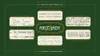
The resulting identity bridges the utility of the working river with the elegance of the vessels themselves. At its center is a custom logotype based on Clockmaker, a lavish typeface inspired by Elandkay and the architectural lettering traditions of Louis Sullivan and Frank Lloyd Wright. Its refined letterforms merge Victorian curves, Art Nouveau grace, Prairie School structure, and Art Deco precision, creating a typographic expression rooted in Chicago’s design lineage.
A signature swash numeral 1 moves like waves and wind, integrating into the logotype or standing alone as a monogram. Paired with Euchre, a Chicago-designed typeface full of charm and sparkle, the system balances civic grandeur with warmth and accessibility.
The vessels’ signature green and gold livery became the foundation of the refreshed color palette, elevated and extended across the full system. Decorative plaque borders, intricate rule lines, and custom guilloché patterns evoke water, currency, craft, and movement, giving the identity a sense of timeless detail across print, digital, signage, merchandise, and the booking experience.
The result is a brand built from Chicago itself: architectural, civic, elegant, and unmistakably tied to the river.
- Design Director, Designer
- Nick Adam
- Designer
- Kevin Moreland
Judges Choice: Lisa McCormick
Chicago Design Archive